Según opinión en Under Consideration:
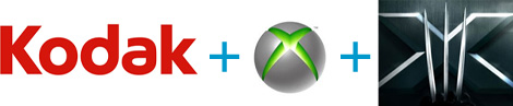







Ta ta quedamo asi...http://www.underconsideration.com/brand ... _shiny.php
The new Xerox logo is now a lowercase treatment of the Xerox name — in a vibrant red — alongside a sphere-shaped symbol sketched with lines that link to form an illustrative "X," representing Xerox's connections to its customers, partners, industry and innovation, and designed to be more effectively animated for use in multi-media platforms.
— Official press release
Signaling a clear change and evoking a dramatic shift in the world's perception of this iconic brand, the visual and verbal identity system for Xerox has undergone a massive redesign. The new signature incorporates a lowercase treatment of the Xerox name — in a vivid red Pantone 1797 — alongside a sphere sketched with lines, called "connectors," that link to form an "X", representing the company's connections to its customers, employees, partners, industry and innovation. The "connectors" are super-graphics that appear as reoccurring design elements.
— Interbrand project description
"The Internet, sponsorships, all kinds of 3D icons — none of that existed when Xerox adopted its old logo," said Maryann J. Stump, senior director of brand strategy for Interbrand. "And you can do animation with a symbol that you just can't do with a wordmark."
— Article on The New York Times

Toleman escribió:en realidad tendría que ser "logo" ya que esta dibujado, "imago" tendría que ser cuando es una imágen.
Es como comparar la manzana, de the beatles y la manzana de Apple, imagotipo y logotipo, repectivamente